 When large companies put technical support content online, the effort frequently comes with a variety of pitfalls. A large company may have dozens or hundreds of products, and each of those products may have dozens or hundreds of support documents, leading to many tens of thousands of support documents.
This can make it exceedingly difficult to find the right help content for any given product and problem. As a result, companies then undertake a variety of web site improvements aimed at helping customers get their problems solved from improving navigation, to providing top FAQ lists, interactive troubleshooting tools, and more.
But how do each of the potential tools affect the customer experience? How do they relate to each other? And what part of the customer experience are they really seeking to improve?
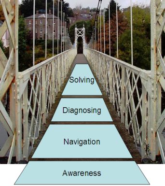
Here is a framework Steve DeRoos and I like to use to think about technical support experiences. To help customers get their problem solved using eSupport, there are four phases of the user experience to consider:
- Awareness
- Navigation
- Diagnosing
- Solving
Awareness: How do your customers become aware that you offer self-support help? If you’re recently improved your self-support help (for example, if you’ve recently added forums), how will customers be aware of those changes? Most customers, particularly web savvy customers, will choose to use a website visit over a phone call to get their problem solved. But less savvy customers, or customers who previously had a bad web support experience are likely to gravitate directly to phone support.
However, the more web-savvy they are, the more likely they are to go direct to Google to get their problem solved.
Navigation: Once the customer has made the decision to use self-support, how do they find it? Do they need to navigate to a product specific area of the website? Can they search and find it? Are there multiple kinds of support content and tools – if so, how does a customer choose which one to use? One example of a tool designed to make support navigation easier is HP’s Automatic Product Detection, a tool that detects what HP products the customer has, and links directly to the support pages for those products.
Diagnosing: When the customer finally arrived at the support content, how do you narrow down the specific problem the customer is having? Is it an install problem or a use problem? If it is a paper jam on an all-in-one printer, is it a paper jam for the printer portion, or the scanner portion? With regular paper or something unusual like labels or card stock?
Solving: When the problem is finally known, what are the steps to solve the problem? How do you insure that the customer follows through on the steps? If there are multiple ways to solve the problem, how do you lead the customer through each of the different ways? How do you know if the problem is resolved?
Having a framework like this helps ensure that all aspects of the user experience are considered. It also helps when considering proposal investments in eSupport: What problem is being solved? What percentage of the user base will it work for? And what is the business impact of improving that aspect of the user experience?
*Bridge photo used under Creative Commons license. Original photo by mozzercork. Shakey Bridge, Cork City, Ireland


Framework makes sense. But could you argue that web savvy customers who start with a Google search shortcut the whole thing? The customer experience journey in this case: Customer recognizes they have a problem. Google for error code or best guess at describing problem. View hits on possible solutions… Corroborate entries and take educated guess at likely best solution. Hopefully, solve problem. Otherwise, look toward 2nd most likely answer. If still not solved, try a fresh google search with fresh search terms. The official HP support doc only comes into play as it receives high credibility (high ranking) on Google. Do we need a parallel framework to accommodate this Google scenario?