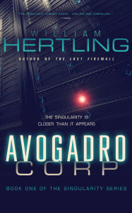
When I was ready to publish Avogadro Corp, I had an image of what I wanted the cover to look like: I wanted a menacing data center. Which is kind of funny when you think about it, but I think the original cover was actually a good advertisement for what you were getting into with the book.
Maureen Gately designed the cover, and she took a simple image and added some depth with the typography. I always liked the way this cover functioned: since Avogadro Corp was science fiction, and most science fiction book covers were very dark, whether you were looking at a physical bookshelf or an Amazon listing, the white cover really stood out.
When AI Apocalypse came out, we didn’t have a ton of time to explore new concepts. There was only four months between the books (December 2011 to March 2012). Maureen took the Avogadro Corp cover, and added visual elements to hint at the move out of the data center and into the real world. On the plus side, it creates a strong series identity. I think it’s a stronger cover, and in some ways, it’s probably the cover we should have used for Avogadro Corp.
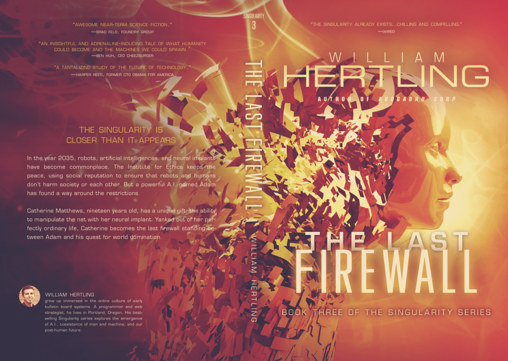
Somewhere between then and The Last Firewall (out in August 2013), I found a piece of stock imagery that jumped out at me, and I knew I wanted to use it for the next cover. To me, this image represents Cat’s personality being uploaded into the net in the climatic battle scene. This was my favorite of the original covers, and I have a blown up version hanging next to my desk that’s been signed by Maureen. I also turned it into a nice laptop sticker, and I’ve mailed out a bunch of those.
In 2014, I started regularly hanging out with my friend Jason Gurley. I first knew Jason as a writer, but he’s also an amazing cover artist who was very much in demand, and had a waiting list months long. But his writing career was starting to take off, and he decided to retire from the cover designing business.
Every time we would see each other, he’d say something to the effect of “You should really let me design you a new cover for Avogadro Corp.” Then it started becoming “You know, I’m retiring from cover design soon, you should really let me design you a new cover before it’s too late.”
Meanwhile, my process for publishing had become more rigorous. Whereas Avogadro Corp went through a single copyediting pass, The Last Firewall went through developmental editing, copyediting, manuscript proofreading, and post-formatting proofreading. Around this time, I noticed that I was still getting some negative reviews on Amazon about typos and grammar issues in Avogadro Corp, and decided I needed to do a second edition of the book to bring it up to par with the rest of the series.
I realized that a new cover would be the perfect complement to the second edition. So one night I emailed Jason and said “OK, I’d like to do it.” And he emailed me back about ten minutes later saying “Well, I just happened to have mocked up these four concepts a month ago, in case you said yes.” One of those four concepts turned into the new cover for Avogadro. One of the other concepts was also really cool, and I asked if I could also later use that concept for the fourth book in the series. Jason graciously said yes.
The next book I worked on was The Case of the Wilted Broccoli, my children’s novel. I knew what I wanted, something that was vaguely a riff on Cory Doctorow’s Little Brother cover, but with little kids, drones, and computers. It clearly required custom artwork, something that neither Maureen nor Jason did. I’m a member of Codex, a writers community, and I soon got a recommendation for M.S. Corley, who did cover design and custom artwork. I loved the cover he created for Wilted Broccoli.
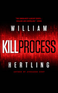
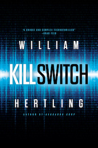
More time passed, and I was far enough along with The Turing Exception to realize I needed to get started on the cover for it. I also needed to address the fact that books 1 and 4 would have new covers in the a certain style, but books 2 and 3 were still in the old style. The series needed to have a consistent identity. So I would need not one cover, but three new covers. By now Jason Gurley had retired from cover design. But Jason had liked the cover Mike Corley did for Wilted Broccoli so much that Jason had transfered all of his clients over to Mike. Mike agreed to do all the new covers for me, and Jason sent him the files for Avogadro Corp and the book 4 concept. Along the way, Mike realized he needed to make a few changes to Avogadro Corp to get it consistent with the rest of the series, so he actually ended up designing all four covers over a really short period of time.
Mike did some great things to create a thematic color treatment for the series. It might not be obvious with the ebook covers, but when you’re holding the physical books in your hand, it stands out. (Look at how the author photo on the back cover is handled, for example.)
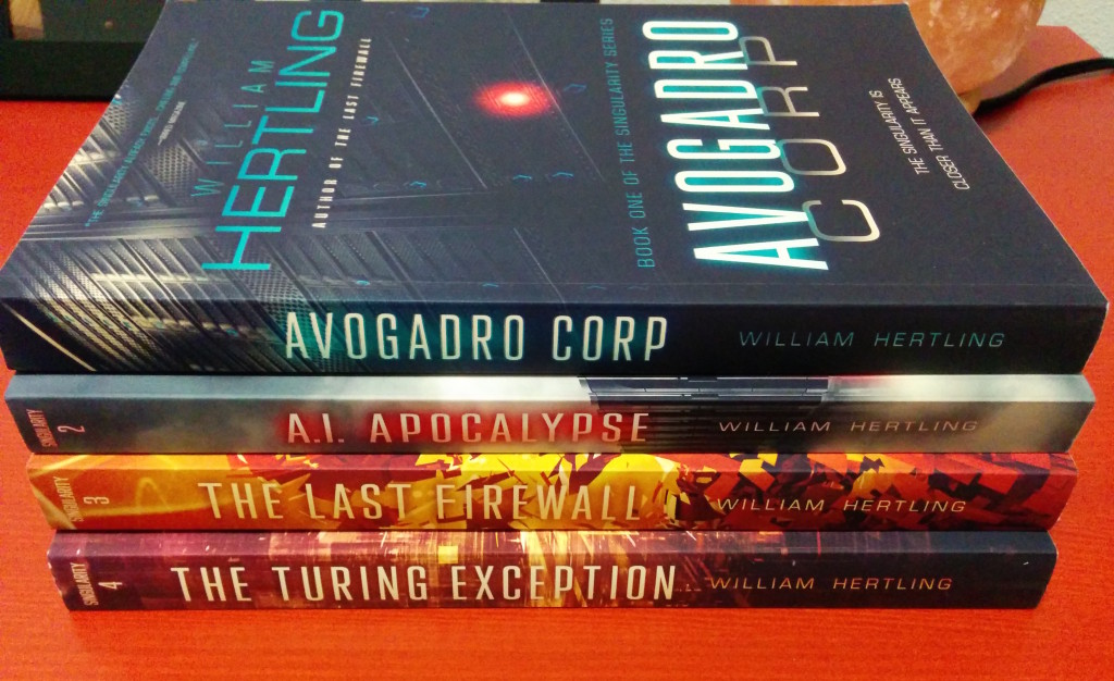
There’s several cool things that happened with the redesign. I really wanted to keep elements of Maureen’s covers, because I felt it was important to honor the work she did, since those original covers really performed quite well, in terms of helping the commercial success of the series. You can clearly see those elements in the revised covers. The servers, clouds, and helicopter are there on the AI Apocalypse, and we’ve still got the woman transforming into packets on The Last Firewall cover.
The other very cool thing Mike did was something both aesthetically pleasing and functional. My print books are manufactured by Createspace in a print-on-demand process. It turns out a good book, but the cover registration is frequently off. This means that any hard edges that should align with where the cover folds around the spine might not be in the right place. So I wanted all of my covers to have a single wrap-around image. And that’s what Mike did.
Here’s an example of one of the paperback covers so you can see the wrap-around effect:
And all of the books with their new covers look lovely together as a set:
If you order any of the paperbacks on Amazon, you’ll be getting the new covers.
I really appreciate all of the hard work and countless revisions that Maureen Gately, Jason Gurley, and M.S. Corley put into these covers. Hopefully you like the new versions, and if you’ve bought the paperback versions, they should look great together on your bookshelf.


A Tale of Four Covers: the convoluted path to converging on a book series identity. http://t.co/oKj4prFmmw #publishing
@hertling Great post, only one correction: I discovered @corleyms because of you and Broccoli, not the other way around!
My 4 new paperbacks arrive Saturday! Cannot wait, I really like the new covers!
William @Hertling shares his evolving thoughts on cover design for his A.I. book series. http://t.co/xonYm1kWyA Thoughts? #selfpublishing
great article, Will! both hysterical and interesting!
A fun read Will.
Man, now I want to go back and buy all the paperback versions 🙂
A Tale of Four Covers. @hertling http://t.co/Mka2qKYkE3